Thee Sacred Souls
Objective
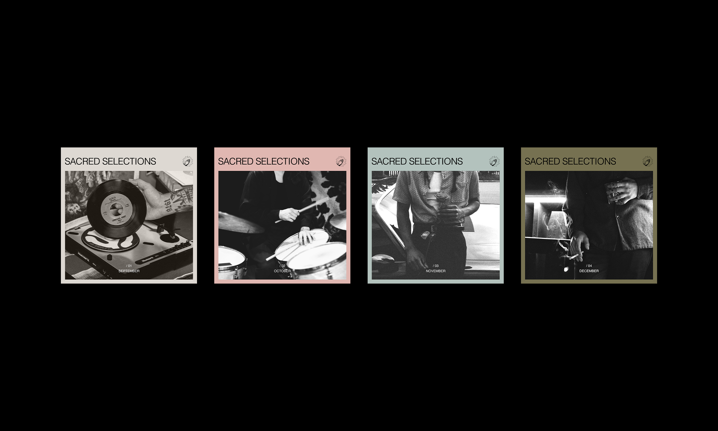
Up and coming soul band Thee Sacred Souls pays homage to 60's Chicano soul bands through their name and their sweet sounds. Based in Southern California, the band draws on their Mexican American backgrounds to create tunes fit for cruising around town in a lowrider. The band brings the older generation and millenial generation together by bringing soul music into the modern age. With this background, the band needed a flexible identity which would brand themselves in the scene, and system which could be built out rhough merchandise, tour posters, and album covers.
Solution
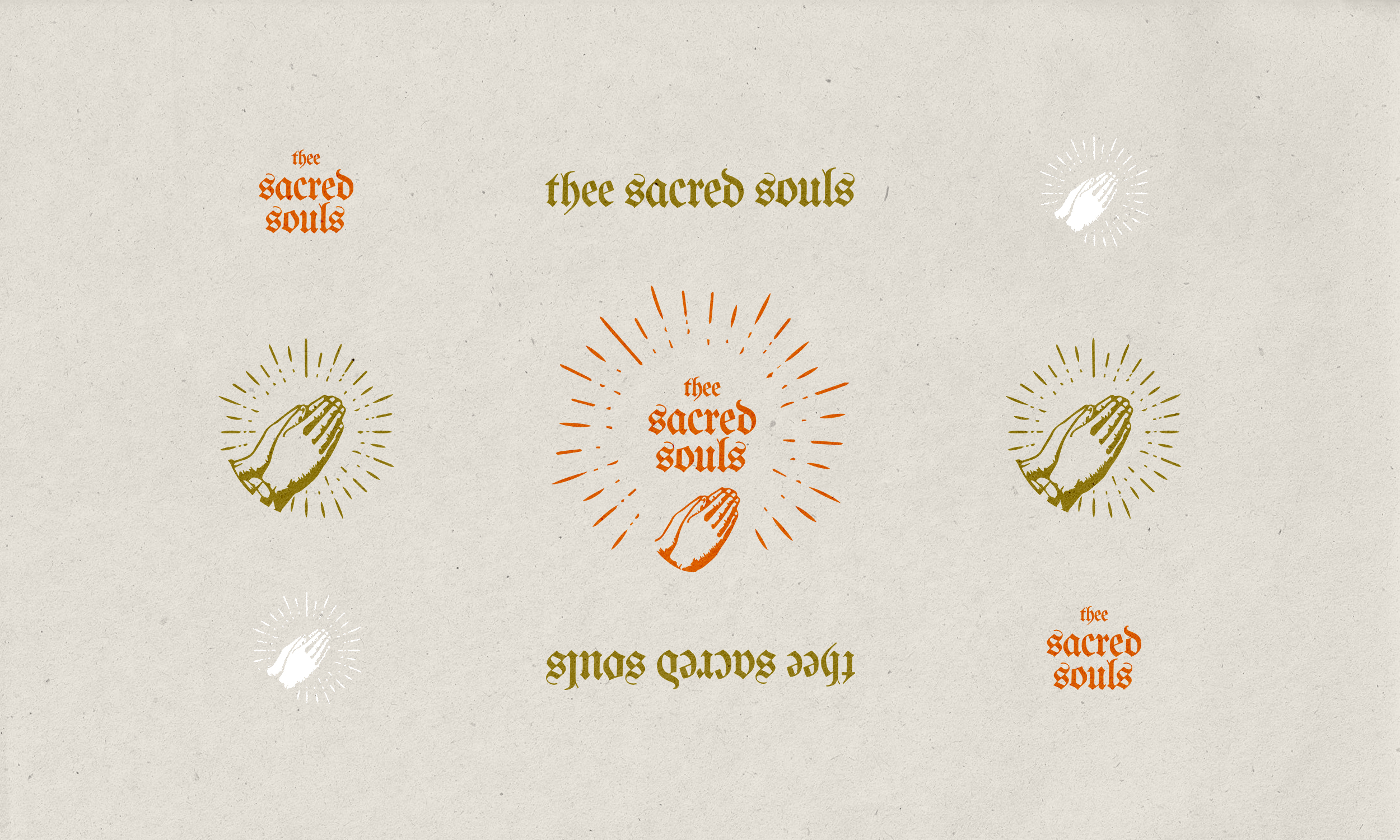
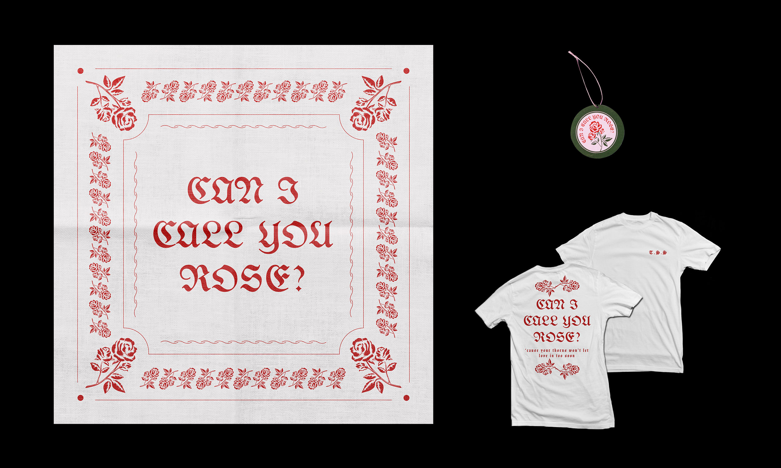
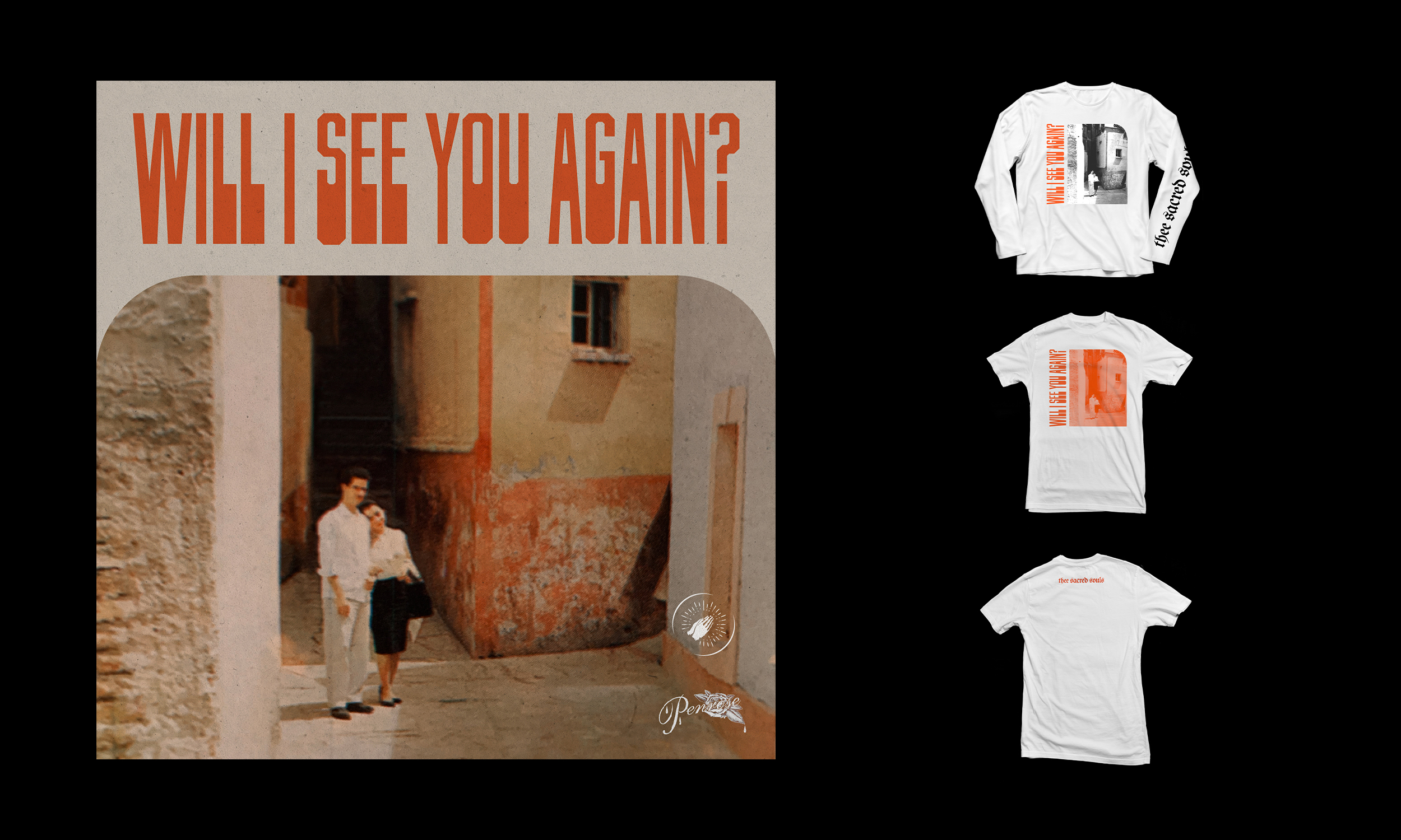
The choice to use blackletter type in the logo was obvious. Blackletter is not only extremely prevalent in the lowrider scene, but has also made a resurgence among young people as a trendy and stylish font choice. The use of blackletter draws and unifies both crowds. The prayer hand icon is used both in the logo lockup and as an isolated stamp where the full logo is not needed. In addition to basic merchandise, a T shirt and bandana were created for the band's first single Can I Call You Rose? which is promoted on the tour.
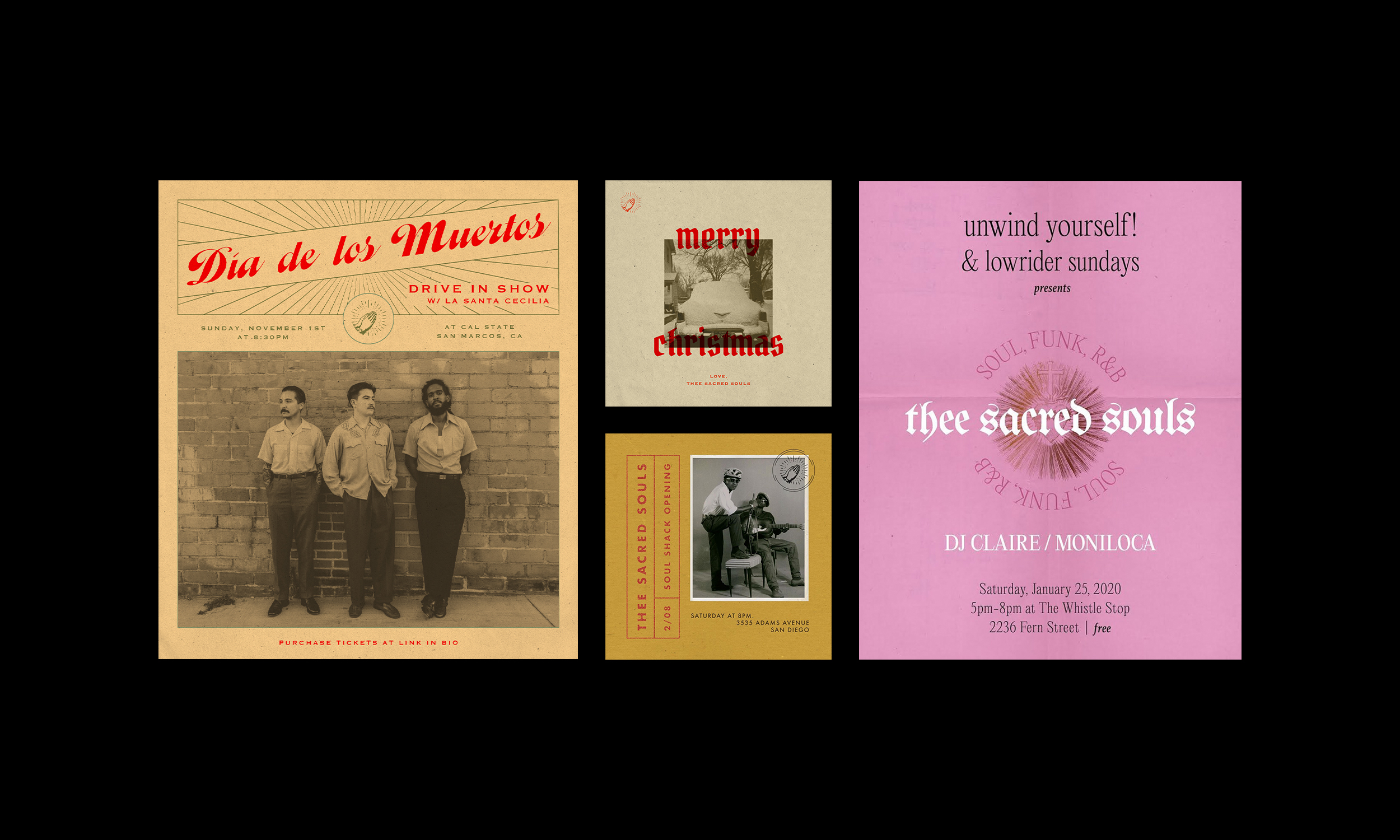
Traditionally, bands use posters that are provided for them by venues, other bands, or a variety of artists. In doing so, most bands create a diluted image with no consistency in branding. In contrast, Thee Sacred Souls' show and tour posters use a system in which color, pattern, and symbols are flexible, but typography and photo style stay within the brand's confines. This results in a uniform and strong image.
Thee Sacred Souls
Objective
Up and coming soul band Thee Sacred Souls pays homage to 60's Chicano soul bands through their name and their sweet sounds. Based in Southern California, the band draws on their Mexican American backgrounds to create tunes fit for cruising around town in a lowrider. The band brings the older generation and millenial generation together by bringing soul music into the modern age. With this background, the band needed a flexible identity which would brand themselves in the scene, and system which could be built out rhough merchandise, tour posters, and album covers.
Solution
The choice to use blackletter type in the logo was obvious. Blackletter is not only extremely prevalent in the lowrider scene, but has also made a resurgence among young people as a trendy and stylish font choice. The use of blackletter draws and unifies both crowds. The prayer hand icon is used both in the logo lockup and as an isolated stamp where the full logo is not needed. In addition to basic merchandise, a T shirt and bandana were created for the band's first single Can I Call You Rose? which is promoted on the tour.
Traditionally, bands use posters that are provided for them by venues, other bands, or a variety of artists. In doing so, most bands create a diluted image with no consistency in branding. In contrast, Thee Sacred Souls' show and tour posters are designed by the same designer using a system in which color, pattern, and symbols are flexible, but typography and photo style stay within the brand's confines. This results in a uniform and strong image.
Thee Sacred Souls
Objective
Up and coming soul band Thee Sacred Souls pays homage to 60's Chicano soul bands through their name and their sweet sounds. Based in Southern California, the band draws on their Mexican American backgrounds to create tunes fit for cruising around town in a lowrider. The band brings the older generation and millenial generation together by bringing soul music into the modern age. With this background, the band needed a flexible identity which would brand themselves in the scene, and system which could be built out rhough merchandise, tour posters, and album covers.
Solution
The choice to use blackletter type in the logo was obvious. Blackletter is not only extremely prevalent in the lowrider scene, but has also made a resurgence among young people as a trendy and stylish font choice. The use of blackletter draws and unifies both crowds. The prayer hand icon is used both in the logo lockup and as an isolated stamp where the full logo is not needed. In addition to basic merchandise, a T shirt and bandana were created for the band's first single Can I Call You Rose? which is promoted on the tour.
Traditionally, bands use posters that are provided for them by venues, other bands, or a variety of artists. In doing so, most bands create a diluted image with no consistency in branding. In contrast, Thee Sacred Souls' show and tour posters use a system in which color, pattern, and symbols are flexible, but typography and photo style stay within the brand's confines. This results in a uniform and strong image.
Thee Sacred Souls
Objective
Up and coming soul band Thee Sacred Souls pays homage to 60's Chicano soul bands through their name and their sweet sounds. Based in Southern California, the band draws on their Mexican American backgrounds to create tunes fit for cruising around town in a lowrider. The band brings the older generation and millenial generation together by bringing soul music into the modern age. With this background, the band needed a flexible identity which would brand themselves in the scene, and system which could be built out rhough merchandise, tour posters, and album covers.
Solution
The choice to use blackletter type in the logo was obvious. Blackletter is not only extremely prevalent in the lowrider scene, but has also made a resurgence among young people as a trendy and stylish font choice. The use of blackletter draws and unifies both crowds. The prayer hand icon is used both in the logo lockup and as an isolated stamp where the full logo is not needed. In addition to basic merchandise, a T shirt and bandana were created for the band's first single Can I Call You Rose? which is promoted on the tour.
Traditionally, bands use posters that are provided for them by venues, other bands, or a variety of artists. In doing so, most bands create a diluted image with no consistency in branding. In contrast, Thee Sacred Souls' show and tour posters use a system in which color, pattern, and symbols are flexible, but typography and photo style stay within the brand's confines. This results in a uniform and strong image.
Emily Carolina is a designer based in San Diego, CA, USA. To get in touch for potential projects, send an email to emily@emilycarolina.com.
Emily Carolina is a designer based in San Diego, CA, USA.
To get in touch for potential projects, send an email to emily@emilycarolina.com.
Emily Carolina is a designer based in San Diego, CA, USA.
To get in touch for potential projects, send an email to emily@emilycarolina.com.
PROJECTS
PROJECTS
PROJECTS
PROJECTS
