Izzy Marcil
Objective
Indie artist Izzy Marcil approached needing cover art for her first single release and upcoming album debut. With no existing branding or art direction, this needed to be established first. In partnership with brand strategist Camille Waterfallen, the brief and direction were established.
Solution
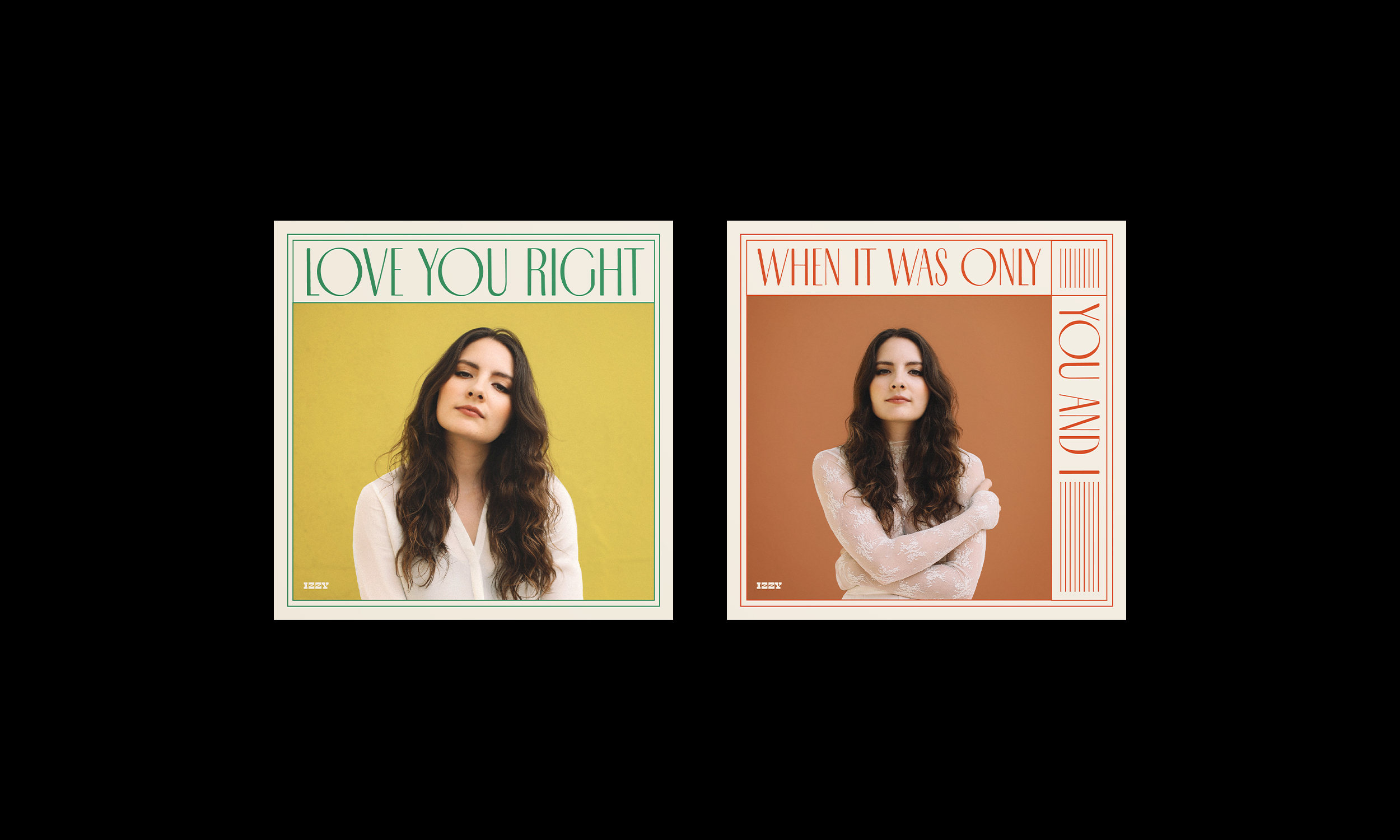
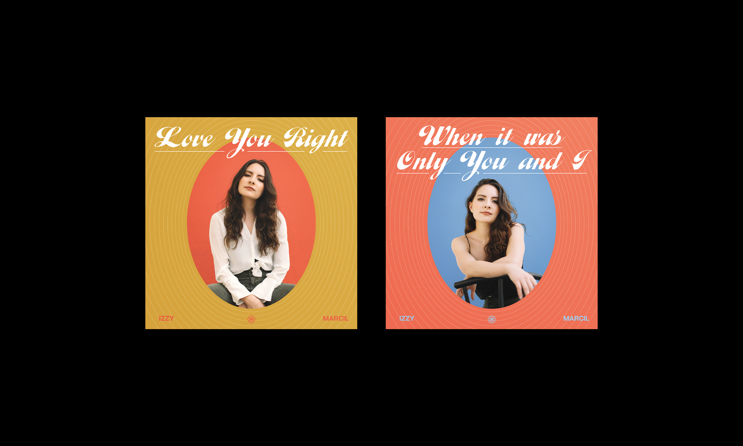
The creative direction was inspired by '70s colors and textures, with a focus on creative use of typography. In the first proposed design, fine line work mimics the high contrast font. This bold font choice paired with a '70s inspired color palette makes for a strong, recognizable design system for upcoming releases. The second proposed design also utilizes a bold font choice, this time a chunky cursive font which stands out from the bright colored backgrounds. The cover imagery is cropped in an oval, letting the typography and design elements act as a frame, as if framing an image inside a locket. The final chosen direction was stripped down to be more image-based.
Izzy Marcil
Objective
Indie artist Izzy Marcil approached needing cover art for her first single release and upcoming album debut. With no existing branding or art direction, this needed to be established first. In partnership with brand strategist Camille Waterfallen, the brief and direction were established.
Solution
The creative direction was inspired by '70s colors and textures, with a focus on creative use of typography. In the first proposed design, fine line work mimics the high contrast font. This bold font choice paired with a '70s inspired color palette makes for a strong, recognizable design system for upcoming releases. The second proposed design also utilizes a bold font choice, this time a chunky cursive font which stands out from the bright colored backgrounds. The cover imagery is cropped in an oval, letting the typography and design elements act as a frame, as if framing an image inside a locket. The final chosen direction was stripped down to be more image-based.
Emily Carolina is a designer based in San Diego, CA, USA. To get in touch for potential projects, send an email to emily@emilycarolina.com.
Emily Carolina is a designer based in San Diego, CA, USA.
To get in touch for potential projects, send an email to emily@emilycarolina.com.
Emily Carolina is a designer based in San Diego, CA, USA.
To get in touch for potential projects, send an email to emily@emilycarolina.com.
PROJECTS
PROJECTS
PROJECTS
PROJECTS