Crossing the Steppe
Objective
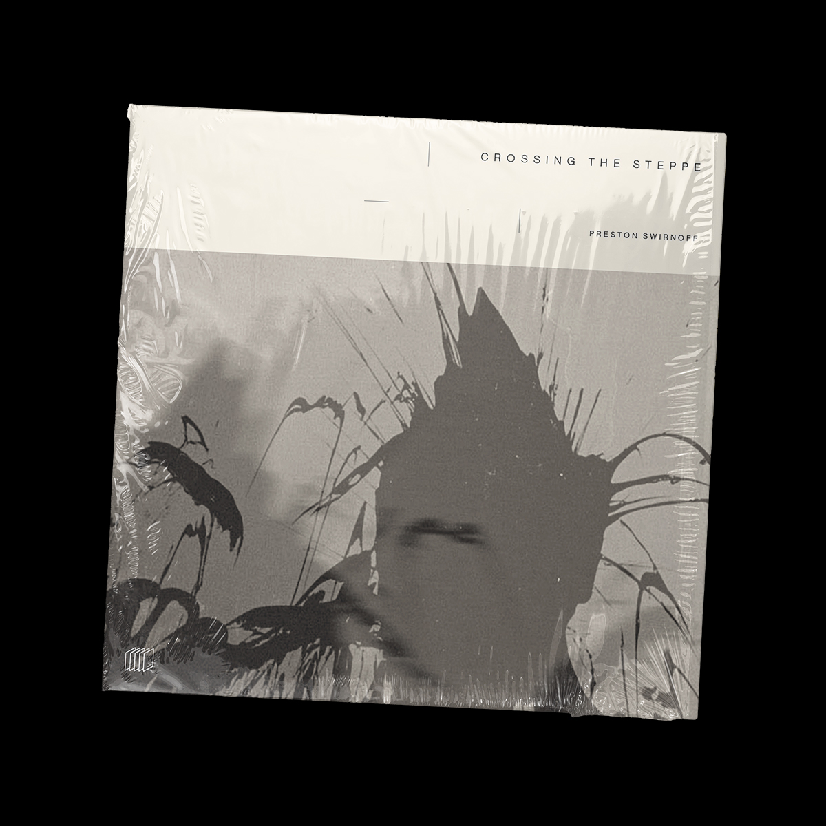
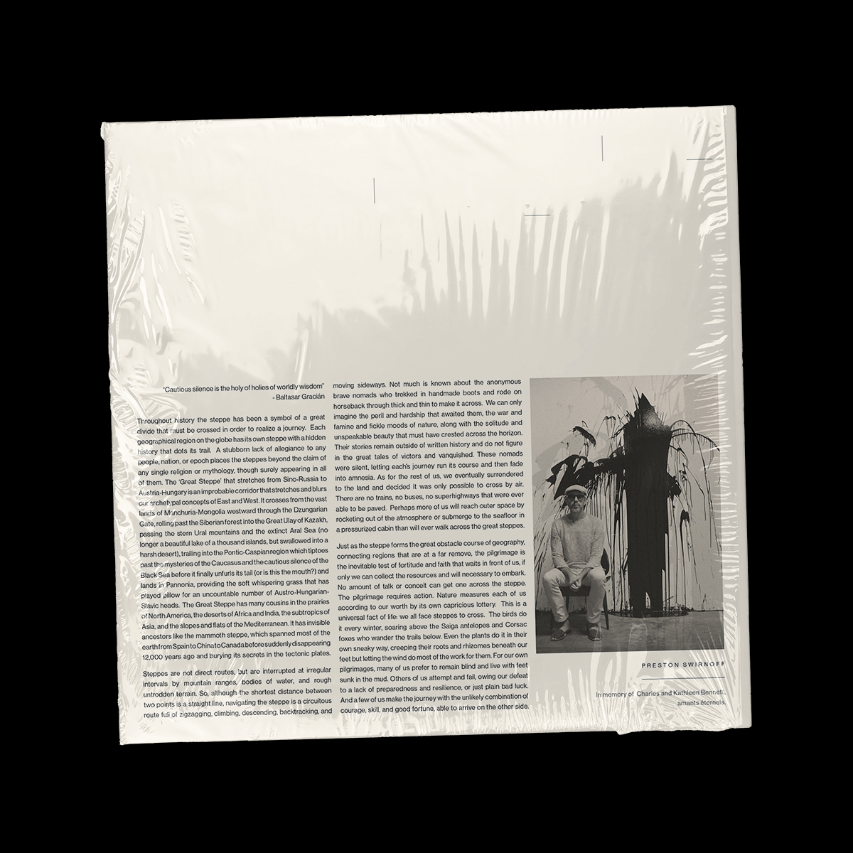
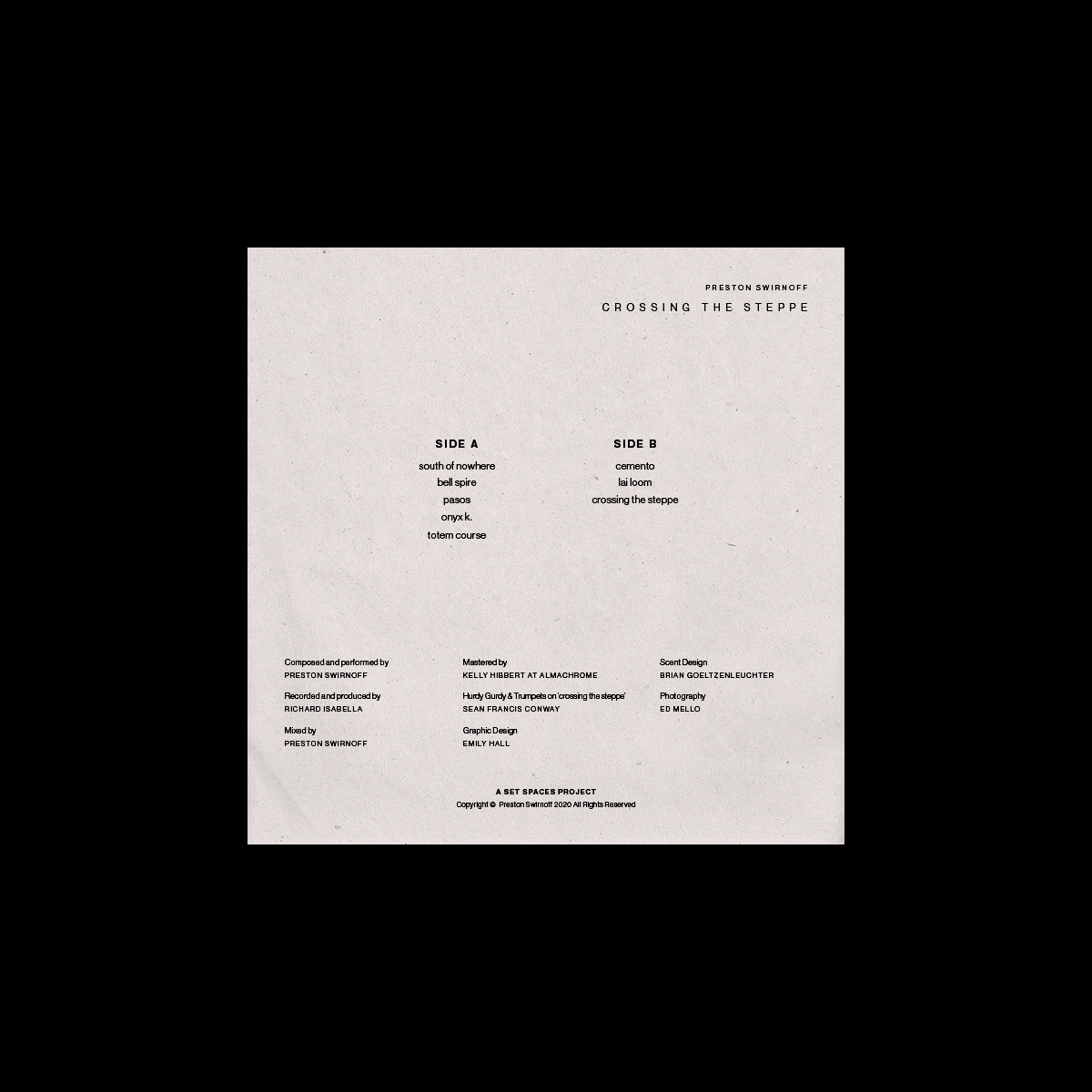
Crossing the Steppe is San Diego-based composer/musician Preston Swirnoff’s second solo album of electroacoustic music. It is the first release on Richard Isabella’s newly launched Set Spaces label, recorded and produced by Isabella in his warehouse studio over several sessions in 2019-2020. The record is pressed on 180g vinyl, including a back cover essay on the Great Steppe by Swirnoff and a custom-scented insert made specially for the record, created by scent artist Brian Goeltzenleuchter.
Detuned guitars, percussion instruments, bells, air organ, kalimba, autoharp, double flutes, vocalizations with breath and whistling, and even the sounds of footsteps are used in a suite of intimate songs and interludes that evoke a fragile dreamlike state. It is the meditation of one faced with a momentous journey, whether internal or out on the open road. The music exists somewhere between musique concrete and rural folk traditions, transporting the listener to a sort of floating purgatory, a disorienting unmappable locale.
The album artwork needed to reflect the haunting, meditative, experimental sound of the music.
Solution
The artist himself felt strongly that the artwork should be abstract and inspired by natural colors and shapes. Using photography from a photoshoot with splattered paint conducted in the warehouse studio, the approach was to use the photo as a texture that blends into the environment. The album sleeve, insert, and all other printed pieces (the vinyl label & sticker) used different shades of creams and beiges, using different weights and textures of paper, to create a layered effect and unique tactile experience when handling each component.
Crossing the Steppe
Objective
Crossing the Steppe is San Diego-based composer/musician Preston Swirnoff’s second solo album of electroacoustic music. It is the first release on Richard Isabella’s newly launched Set Spaces label, recorded and produced by Isabella in his warehouse studio over several sessions in 2019-2020. The record is pressed on 180g vinyl, including a back cover essay on the Great Steppe by Swirnoff and a custom-scented insert made specially for the record, created by scent artist Brian Goeltzenleuchter.
Detuned guitars, percussion instruments, bells, air organ, kalimba, autoharp, double flutes, vocalizations with breath and whistling, and even the sounds of footsteps are used in a suite of intimate songs and interludes that evoke a fragile dreamlike state. It is the meditation of one faced with a momentous journey, whether internal or out on the open road. The music exists somewhere between musique concrete and rural folk traditions, transporting the listener to a sort of floating purgatory, a disorienting unmappable locale.
The album artwork needed to reflect the haunting, meditative, experimental sound of the music.e music.
Solution
The artist himself felt strongly that the artwork should be abstract and inspired by natural colors and shapes. Using photography from a photoshoot with splattered paint conducted in the warehouse studio, the approach was to use the photo as a texture that blends into the environment. The album sleeve, insert, and all other printed pieces (the vinyl label & sticker) used different shades of creams and beiges, using different weights and textures of paper, to create a layered effect and unique tactile experience when handling each component.

Emily Carolina is a designer based in San Diego, CA, USA. To get in touch for potential projects, send an email to emily@emilycarolina.com.
Emily Carolina is a designer based in San Diego, CA, USA.
To get in touch for potential projects, send an email to emily@emilycarolina.com.
Emily Carolina is a designer based in San Diego, CA, USA.
To get in touch for potential projects, send an email to emily@emilycarolina.com.
PROJECTS
PROJECTS
PROJECTS
PROJECTS