Maison Cleo
Objective
Maison Cléo is a clothing brand run by a mother and daughter duo in France. They work together to design and hand sew unique garments, specializing in blouses and dresses. They have established a feminine, airy style using recycled, all natural materials such as silk, cotton, and linen. Many pieces are delicate and sheer, revealing the unique shapes of the wearer beneath. The target audience of Maison Cléo is 20-35 year old women who value handmade, made to order clothing. The brand has a big cult following online, and needed branding and collateral to match their online presence.
Solution
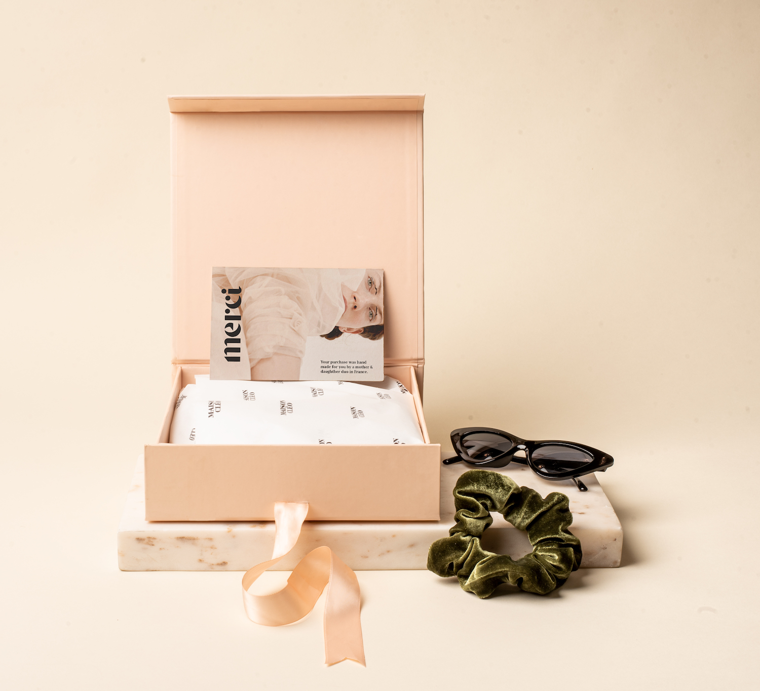
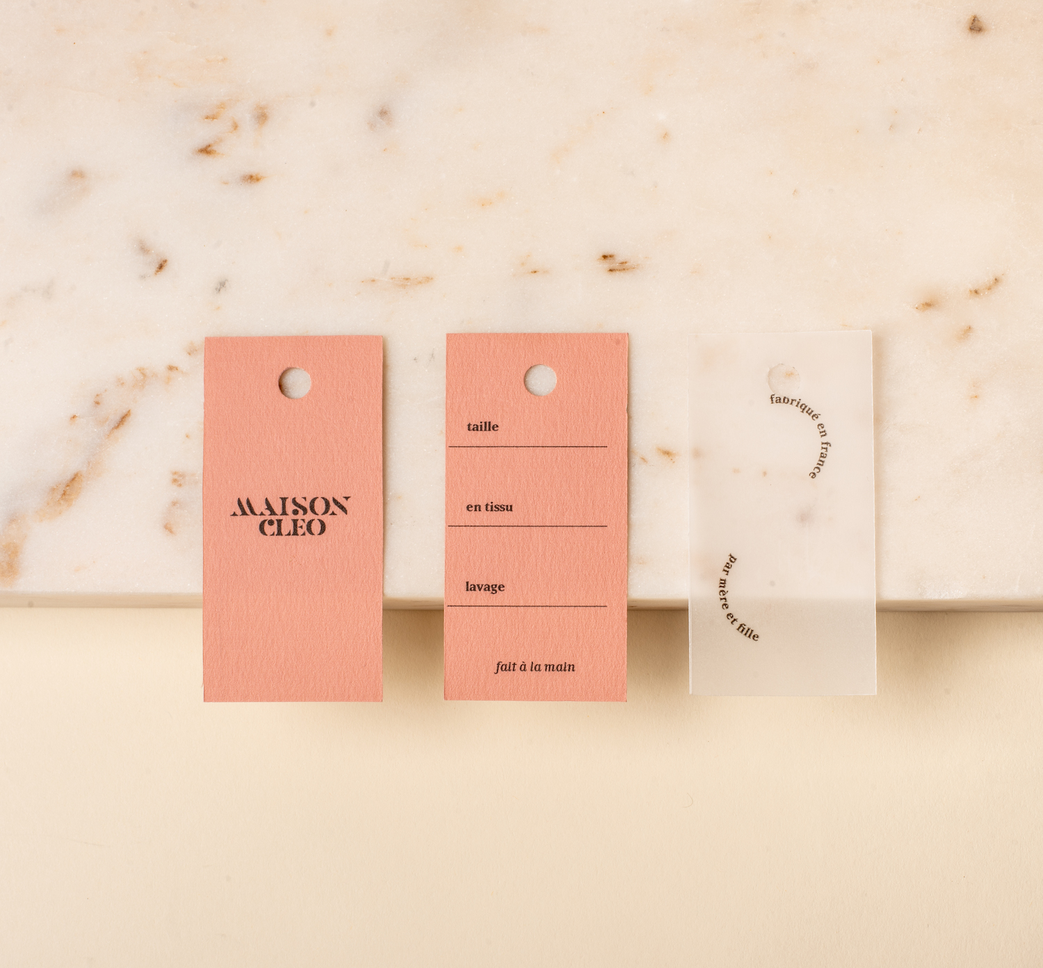
The personality of the Maison Cléo brand is feminine and delicate, yet bold. The brand colors are mostly subtle nudes with pink and a pop of cherry red. Typography plays a large role in the brand, conveying several key messages. A modern geometric display typeface is using for messaging and headlines. Type used on a circular path creates round, wavy shapes reminiscent of billowing fabric. The lookbook, made to highlight Maison Cleo’s most popular styles, utilizes this playful typography while adhering to a clean grid. Feminine, unreserved, and modern elegance are words to describe the new identity.
Maison Cleo
Objective
Maison Cléo is a clothing brand run by a mother and daughter duo in France. They work together to design and hand sew unique garments, specializing in blouses and dresses. They have established a feminine, airy style using recycled, all natural materials such as silk, cotton, and linen. Many pieces are delicate and sheer, revealing the unique shapes of the wearer beneath. The target audience of Maison Cléo is 20-35 year old women who value handmade, made to order clothing. The brand has a big cult following online, and needed branding and collateral to match their online presence.
Solution
The personality of the Maison Cléo brand is feminine and delicate, yet bold. The brand colors are mostly subtle nudes with pink and a pop of cherry red. Typography plays a large role in the brand, conveying several key messages. A modern geometric display typeface is using for messaging and headlines. Type used on a circular path creates round, wavy shapes reminiscent of billowing fabric. The lookbook, made to highlight Maison Cleo’s most popular styles, utilizes this playful typography while adhering to a clean grid. Feminine, unreserved, and modern elegance are words to describe the new identity.
Emily Carolina is a designer based in San Diego, CA, USA. To get in touch for potential projects, send an email to emily@emilycarolina.com.
Emily Carolina is a designer based in San Diego, CA, USA.
To get in touch for potential projects, send an email to emily@emilycarolina.com.
Emily Carolina is a designer based in San Diego, CA, USA.
To get in touch for potential projects, send an email to emily@emilycarolina.com.
PROJECTS
PROJECTS
PROJECTS
PROJECTS